
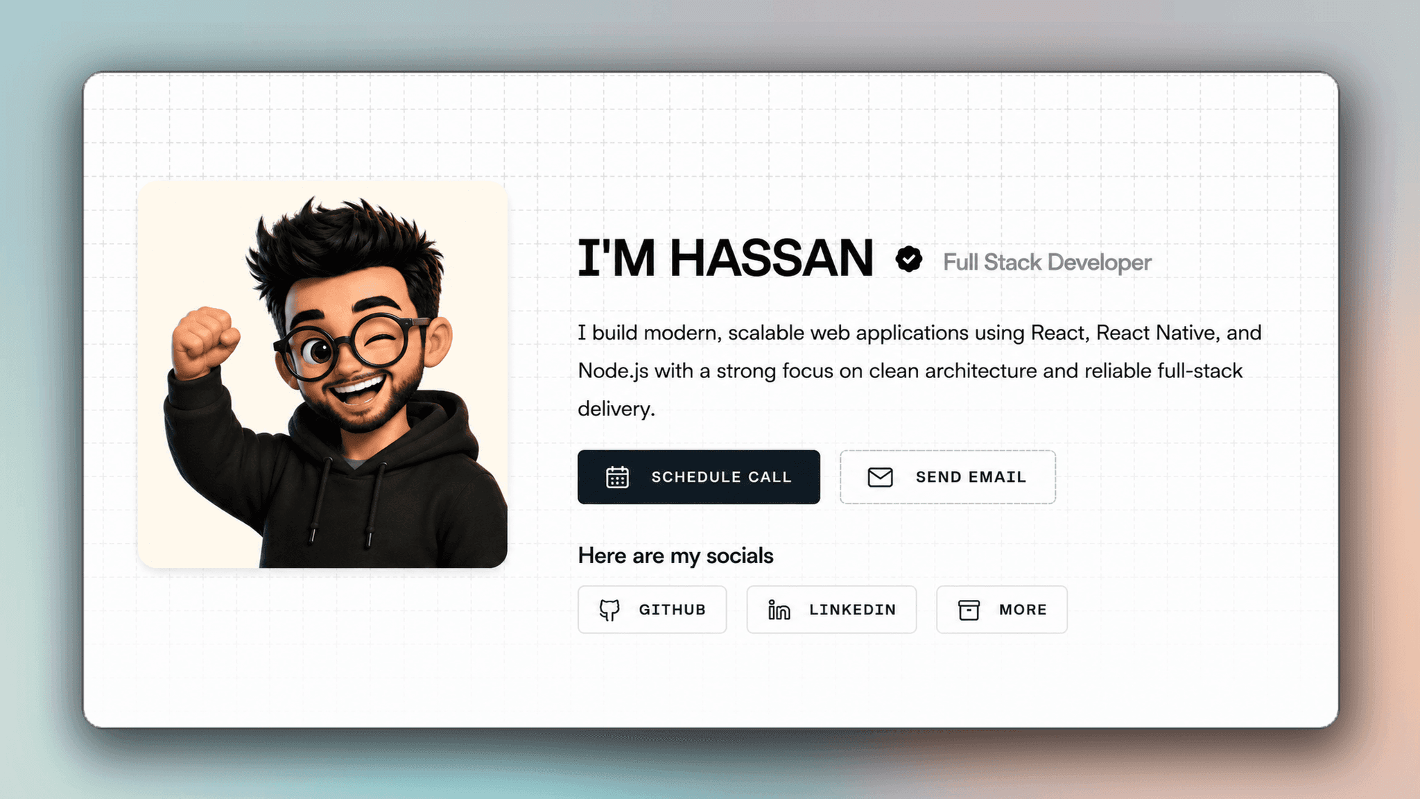
Executive Summary
This portfolio is a custom-built, performance-first web application designed to showcase my work as a full-stack developer. Built with Next.js 16, TypeScript, and Tailwind CSS v4 — it represents my design philosophy of clean, technical, and high-performance digital experiences.
Why Build a Custom Portfolio?
As a developer, your portfolio is the most important project you'll ever build. It's not just a showcase — it's a living proof of your capabilities. Template-based portfolios fail to communicate the depth of engineering skill that goes into building real-world applications.
- Design Control: Full ownership over every pixel, animation, and interaction. No template constraints.
- Performance: Server components by default, with client-side interactivity added only where it earns its keep.
- Branding: A dashed-border, uppercase, monochrome identity that stands out from generic developer portfolios.
- Learning: Building a portfolio from scratch forces you to think deeply about architecture, accessibility, and micro-interactions.
Architecture & Design Decisions
The portfolio is built on Next.js 16 with the App Router, leaning on server components for static content and client components only where real interactivity is needed — the avatar transition, the command palette, the theme toggle.
- Data-Driven Design: All content — projects, blog posts, tech stack — lives in typed modules under lib/. Adding a new project requires zero UI code changes.
- Component Architecture: Each section (Hero, Projects, Blog, Contribution Graph) is a self-contained, reusable component with typed props.
- Animation System: A small reveal primitive and hand-tuned CSS keyframes handle scroll entrances and micro-interactions — no heavy animation library.
- Theme System: Full dark/light mode support driven by CSS custom properties, tuned to look intentional in both modes, not just inverted.
Technical Implementation
The core of the portfolio is a data-driven rendering system. Here's how the project cards are dynamically generated:
// Data-driven project rendering
import { PROJECTS } from "@/lib/projects";
import ProjectCard from "./ProjectCard";

export default function Projects() {
  return (
    <section id="projects" className="max-w-2xl mx-auto px-4">
      <div className="grid grid-cols-1 sm:grid-cols-2 gap-6">
        {PROJECTS.map((project, i) => (
          <ProjectCard
            key={project.slug}
            project={project}
            revealDelay={i * 80}
          />
        ))}
      </div>
    </section>
  );
}
Design Philosophy
The visual design follows a brutalist-minimal aesthetic — dashed borders, uppercase typography, monochrome palette with strategic accent colors. Every design choice is intentional:
- Dashed Borders: Create visual separation without heavy dividers. They feel technical and developer-oriented.
- Uppercase Typography: Bold, uppercase headings with tight tracking communicate confidence and precision.
- Grid Background: A subtle dot-grid pattern adds depth without distraction, reinforcing the engineering aesthetic.
- Micro-Animations: Hover effects, scroll reveals, and the avatar glitch transition make the interface feel alive without being distracting.
Key Features
- GitHub Contribution Graph: Real contribution data rendered as an interactive heatmap.
- Command Palette: Keyboard-driven navigation (⌘K) for instant access to any section or project.
- Blog System: A typed blog with category labels, reading-time estimates, focus mode, and text-to-speech.
- Dynamic Project Pages: Each project has its own detail page with overview, features, and impact.
- Glitch Avatar Transition: A hand-tuned, physics-based avatar swap with multiple randomized glitch variants.
Lessons Learned
- Ship early, iterate often: the first version was basic — each pass added depth and polish.
- Design is engineering: good UI isn't just aesthetics — it's timing curves, spacing, and consistency.
- Data-driven beats hard-coded: centralizing content in typed modules makes the site infinitely extensible.
- Animations must serve purpose: every transition should communicate state change, not just decorate.